
My Palettes and Paints
I’m going to go over the palettes and paints I prefer to use when painting. I want to share the colors and paints that I prefer to use for watercolor painting. I’ll cover:
My main palette and what’s in it
How I developed my color palette
Other paints I like to use:
Kuretake Gansai Tambi watercolors
Dandelion Paint Co liquid watercolors
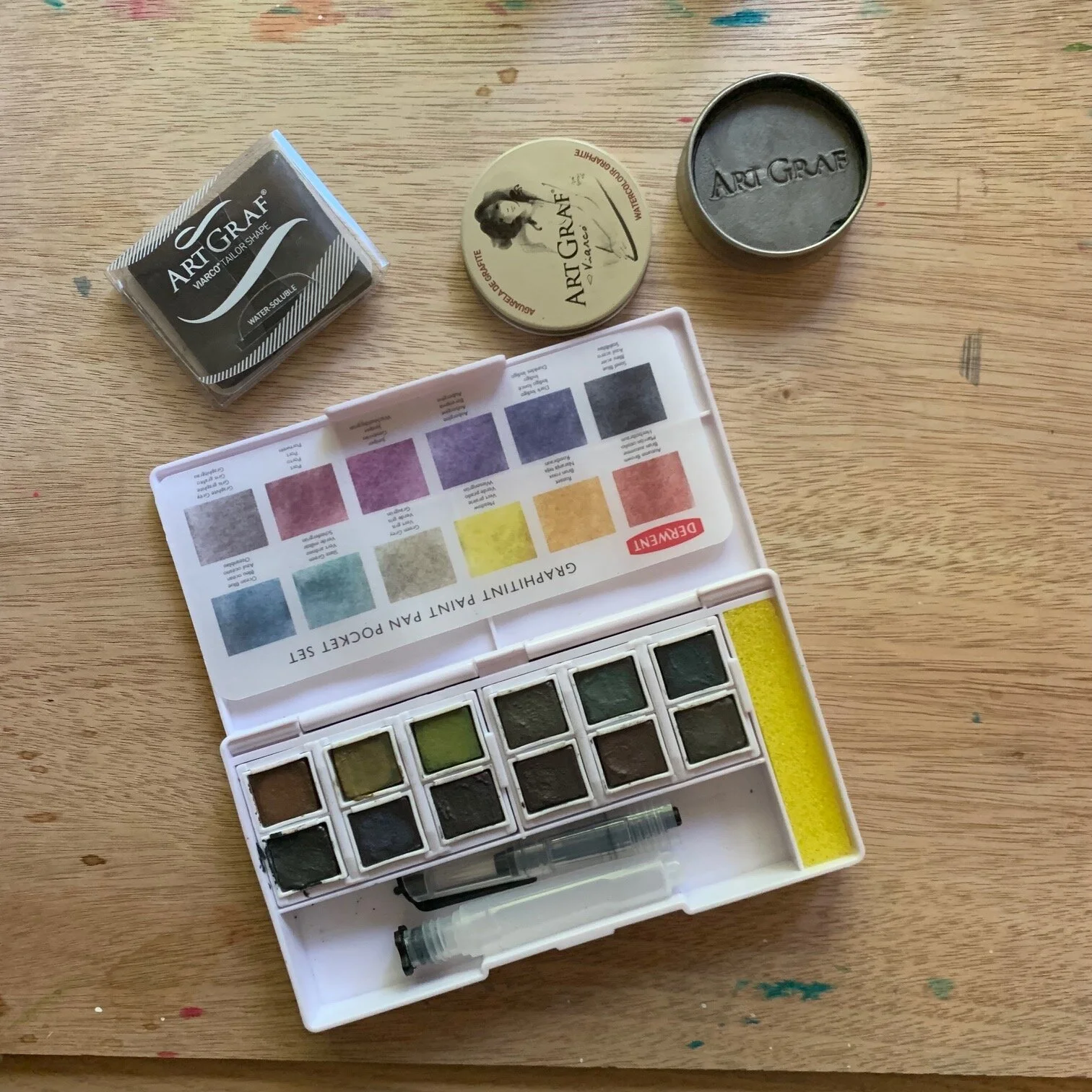
Graphite watercolors
White paints
Inks
Main Palette
This is my main palette. To store my pans, I’m using a tin I got off of Amazon. I’m using full pans for most of the colors. I like full pans more than half pans because it’s easier to get the paint out. I filled most of these pans myself from tubes.

Most of the colors I use are Holbein watercolors. I like the quality of their paints. The paint is smooth and easy to paint with and mix. Holbein also has a lot of great colors. I bought most of my tubes of Holbein paints from St. Louis Art Supply. They are a small art business in St. Louis and they carry a lot of good quality hard to find art supplies. I’m not in St. Louis, but I order from them online and recommend them.
These are the colors in my palette. From top to bottom, left to right. Colors are Holbein unless otherwise mentioned.
Column 1
Juane Brilliant #1
Juane Brilliant #2
Permanent Yellow Deep
Qunacridone Gold
Permanent Yellow Orange
Scarlet Lake
Column 2
Shell Pink
Brilliant Pink
Crimson Lake
Quinacridone Violet
Lilac
Mineral Violet
Column 3
Cobalt Turquoise Light
Manganese Blue Nova
Peacock Blue
Marine Blue
Cobalt
Indigo
Column 4
Horizon Blue
Compose Blue
Phthalo Blue Yellow Shade
Ultramarine Blue
Prussian Blue
Payne’s Grey
Column 5
Sap Green
Hooker Green
Mineral Violet + Permanent Yellow Deep - This isn’t an out of the tube color, but I mixed two Holbein colors to get the brown I wanted and put that into a pan.
Vandyke Brown
Grey of Grey
Neutral Tint
Column 6
Arteza Gold metallic watercolor
Arteza Aztec gold metallic watercolor
Arteza Silver metallic watercolor
Daniel Smith Moonglow
Holbein Raw Sienna
How I Developed My Palette
How did I decide on these colors? That part was hard and took me a while. It can be difficult to figure out what colors you need and want in your palette and to build one for the first time.
What I did know is that most out of the box assortments of watercolors didn’t have the colors I was interested. But I didn’t know what my colors were.
What helped me the most was taking a Domestika course called Creation of Color Palettes with Watercolor by Ana Victoria Calderon.
In the course, she has students look at different inspirations and pull colors from that to build a palette of no more than 24 colors. Here is what I came up with in the class:

In the first iteration, I mixed a lot of colors from what I had. Then I tried to find out of the tube colors that were a close match. I started looking at both Holbein and Kuretake, but eventually settled down on mostly Holbein colors.
My final palette has more than 24 colors. That’s ok. Ana recommended keeping to 24 colors or less because too many colors can overwhelm and make it hard to choose. And you can always mix your colors.

As I was finding my colors, I came across some additional colors from Holbein that I really liked so I ended up just including them as well.
I have a crazy amount of blues in my palette. I like blue, but I don’t necessarily paint a ton with blue. But what happened is that I ordered quite a few different shades of Holbein blues to find the ones I really wanted. Then I ended up really liking all of them, so I put them all in my palette. I have some blues that are pretty close to each other, but each one is different enough that I’m happy to keep it around for now.
The great thing about a palette is that you aren’t stuck with it and can always change out colors as needed and as you grow or your tastes change.
I added the Arteza metallic colors so I can have them available in case I want to do some accents.
The Daniel Smith Moonglow is there because it’s a fun color, but I don’t use it very often.
I added the ultramarine and raw sienna because those colors are good to mix with some purple or red to make a nice shadow color. But I don’t use those colors much on their own.
Kuretake watercolors
In addition to my main palette, I have a couple of tins of Kuretake Gansai Tambi watercolors that I like to use.
I like the Kuretake watercolors because they come in this big pans that are about twice the size of a regular full pan. The colors are a little more opaque and their selection of colors are nice. They are strong and bright colors.

I’ve selected out a bunch of their colors that I like and put them together into tins like my main palette, by attaching magnets to the bottom of the pans.
St. Louis Art Supply sells individual pans of all of Kuretake’s colors, so I’ve ordered a lot from them.
Dandelion Paint Co Liquid Watercolors
I also often use the liquid watercolor paints from Lets Make Art. These are dye based inks, not pigment based like most watercolor. I like that these liquid watercolors are super vibrant. Because they are liquid, they are also very easy to mix and to do wet on wet techniques with. The downside is they are not as lightfast as pigment based watercolors. But they are very easy to paint with and I enjoy working with them.

Graphite Watercolors
I occasionally use graphite watercolors to add extra texture or character to a painting. These paints have a slight shimmer to them. Some you can draw with first and then add water on the paper, and others you use like a regular watercolor paint. These are good for pantings with more of a sketch look.
Whites and Inks
For when I need white, I use Dr. PH Marton’s Bleed Proof White and Copic Opaque White.

Sometimes I used inks. I like Dr. Ph Martin’s inks. The Iridescent inks are good for when I want something stronger than a metallic watercolor.

That’s it. There are other paints I have and use, but these are the ones I use on a regular basis. Thanks for reading!
If you want to see more about my palette, you can watch my video on Instagram.